Improvements on the Chat widget dimensions
1674208800000
Improvement
We’re making a few adjustments to the dimensions of the widget.
The height will dynamically adjust based on the screen size while never going over the top part of the screen so it doesn’t overlap with your shop’s header (navigation bar).
Just as before, when the screen size is too small to ensure a good user experience the widget goes into mobile view (fullscreen). We’ve tweaked a bit the criteria behind this to capture more scenarios than in the past.
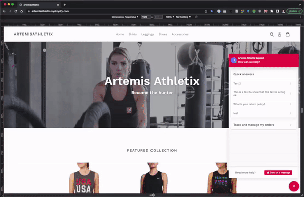
These updates improve the shoppers’ experience with the chat for any device they use to access it.
Did you like this update?
{error_message}
Leave your name and email so that we can reply to you (both fields are optional):
Thanks for your feedback!
Engineering Manager