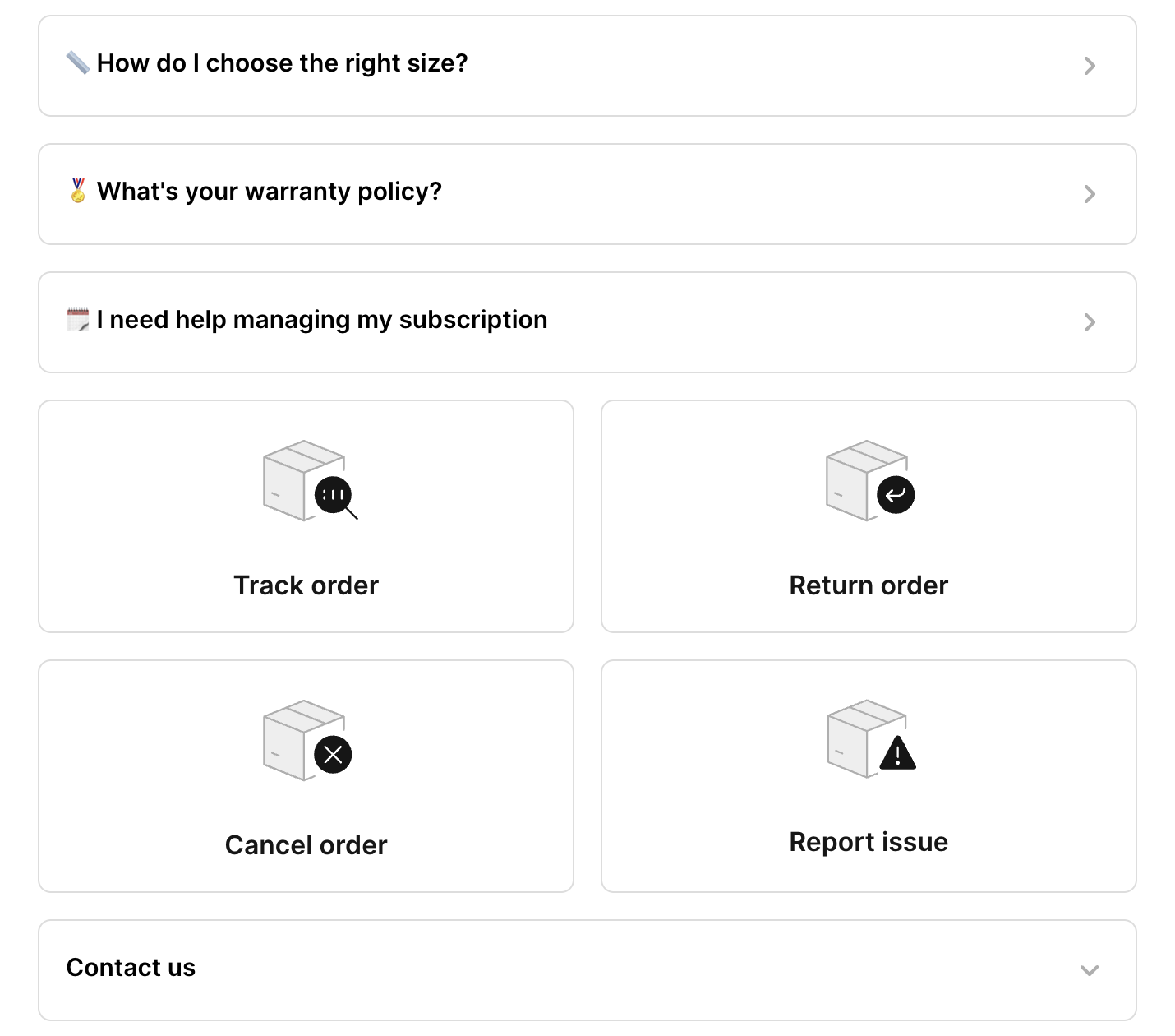
Cleaner Contact Form entry point with Contact us button
1715610389198
Exciting Update for Merchants! 🚀 We're introducing a game-changing enhancement to our Contact Form entry point page.
Now, instead of displaying the contact form directly, we provide an option for you to hide it behind a sleek "Contact Us" button. This means that shoppers will now explore your Order Management and Multi-Flows first, empowering them to find solutions on their own. When they still need help, they can easily access the contact form with a simple click.

If you’re creating a contact form for the first time, your newly created Contact Form will automatically adopt this new display layout.
For your existing Contact Form, you can easily switch to the new layout by checking the Expand Contact Form feature in Settings > Contact Form > Customization.
This strategic change encourages shoppers to explore before reaching out for assistance, significantly reducing the number of tickets you receive. It's a win-win for everyone!
ℹ️ Just a friendly reminder: This new display option will only be available for merchants with Order Management Flows or Multi-Flows enabled.
Did you like this update?
![]()
![]()
![]()
Leave your name and email so that we can reply to you (both fields are optional):
