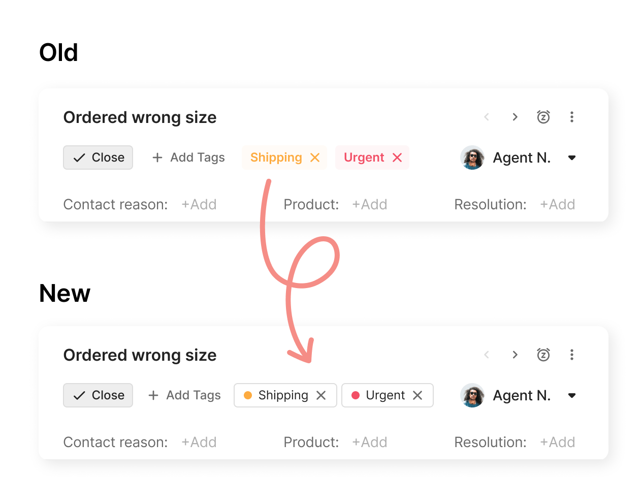
Improving Tag Accessibility: Meeting WCAG Standards with Enhanced Contrast
timestamp1730379974472
In our commitment to building an accessible product, we’re enhancing the Tags component to meet WCAG (Web Content Accessibility Guidelines). Currently, tags allow for any color selection, which can make text challenging to read due to insufficient contrast. This update addresses these limitations to ensure a more inclusive user experience.

Why This Matters
The contrast ratio of text to background must meet specific standards (4.5:1 for regular text, 3:1 for larger or bold text) to ensure readability for people with low vision or other visual needs. With this improvement, tags will always have sufficient contrast, no matter the color selection, making text clearer and easier to read across all customer interactions.
The Benefits
Accessibility Compliance: This update ensures we meet ADA and WCAG requirements for better usability.
Enhanced Readability: Improved contrast provides a clear visual experience, reducing eye strain and increasing legibility.
Inclusion for All Users: We’re creating a product that’s more accessible to all, reinforcing our commitment to user-friendly design.
This upgrade will positively impact all areas where tags are used, creating a consistent and inclusive experience throughout the platform such as Analytics, Settings and so on.
Note: We’re rolling out these updates gradually, so you may see changes appear over time. This approach allows us to ensure a smooth experience as we enhance accessibility across the platform.
Did you like this update?
![]()
![]()
![]()
Leave your name and email so that we can reply to you (both fields are optional):
