Coming soon: Tickets Sidebar’s new look!
timestamp1696588603881
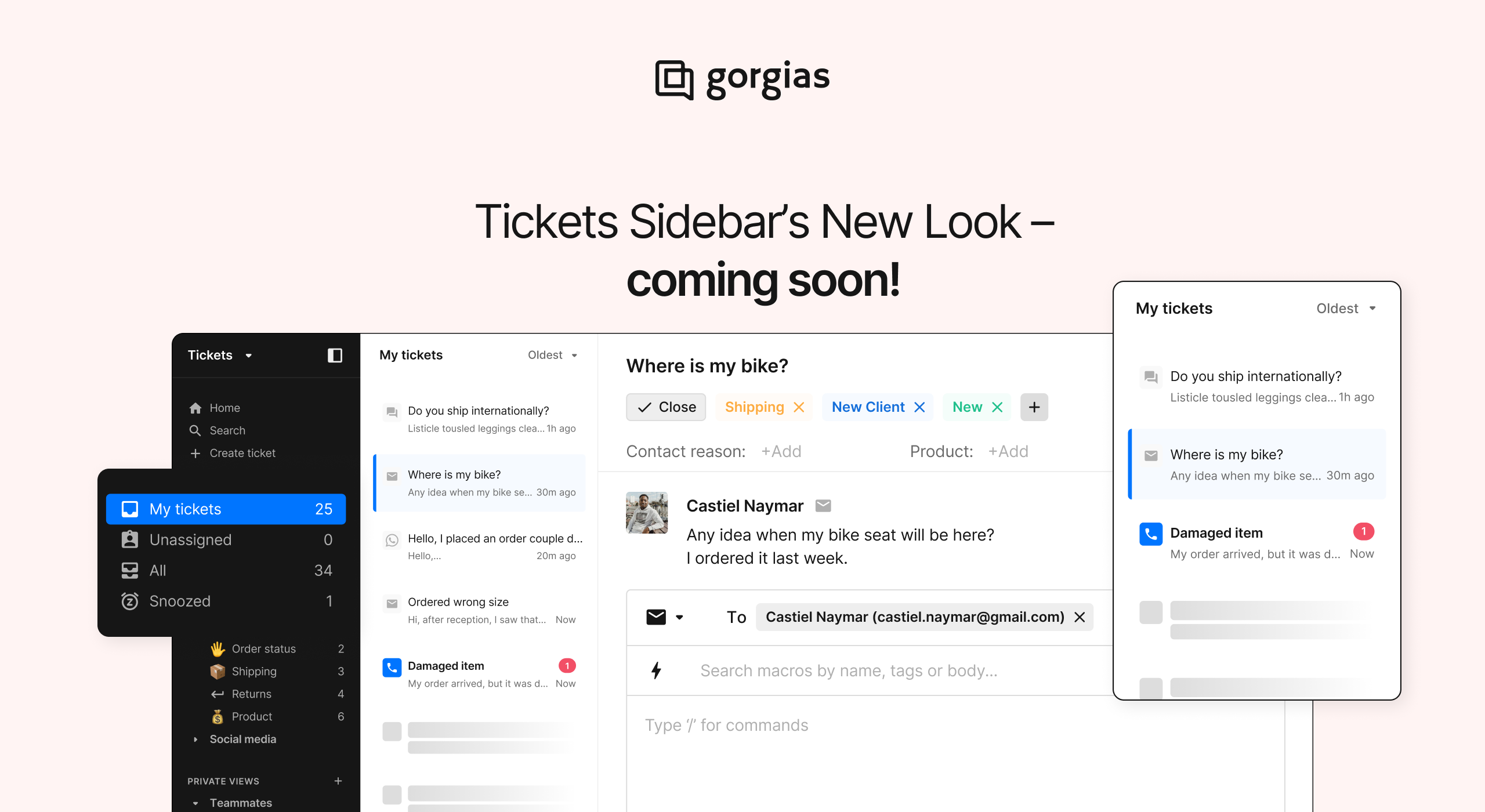
We’re constantly impressed with how teams use Gorgias to deliver great customer service, especially within the Tickets workspace. Each day, our users tackle a wide range of tasks, from triaging tickets to chatting with customers and building efficient workflows.
As a follow-up to our new sleek black theme introduced earlier this year, we're excited to share another upgrade: A new look for the Tickets Sidebar! 😍
In the upcoming weeks, we'll implement an improved navigation bar for the Ticket View — your go-to workspace. This is where the action happens every day, so we're making big upgrades to make your job much, much easier. Check more details below!
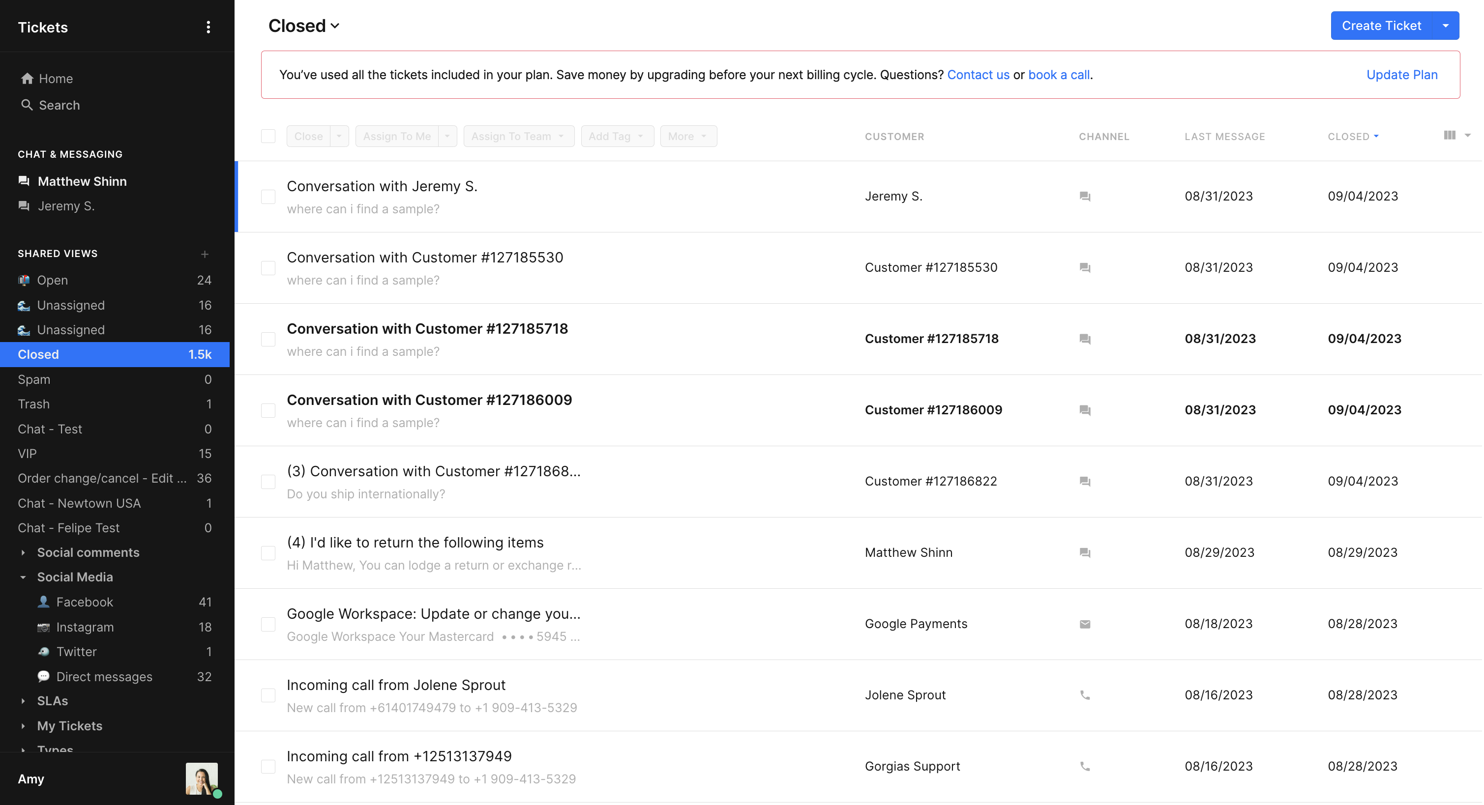
The old look!
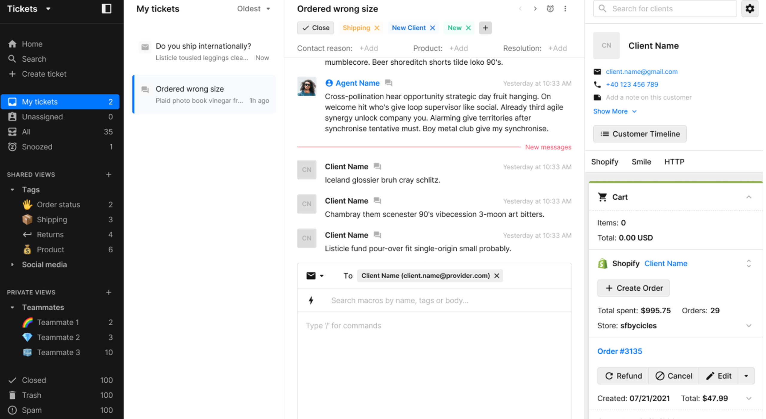
The new look!
💡 What’s going to change?
A simpler, cleaner Views sidebar
In our first release, we're simplifying the Views sidebar to make your daily tasks smoother, eliminating unnecessary views and emojis.
New default system Views: Admins will gain control over system Views visible to all users in the Tickets Sidebar, including relevant options to every team.
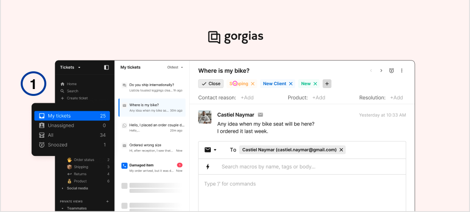
My tickets: Open tickets assigned to me
Unassigned: Open tickets that are not assigned to anyone
All: All open tickets
Snoozed: Snoozed tickets assigned to me
Trash: Deleted tickets
Spam: Tickets identified as spam
Closed: All closed tickets
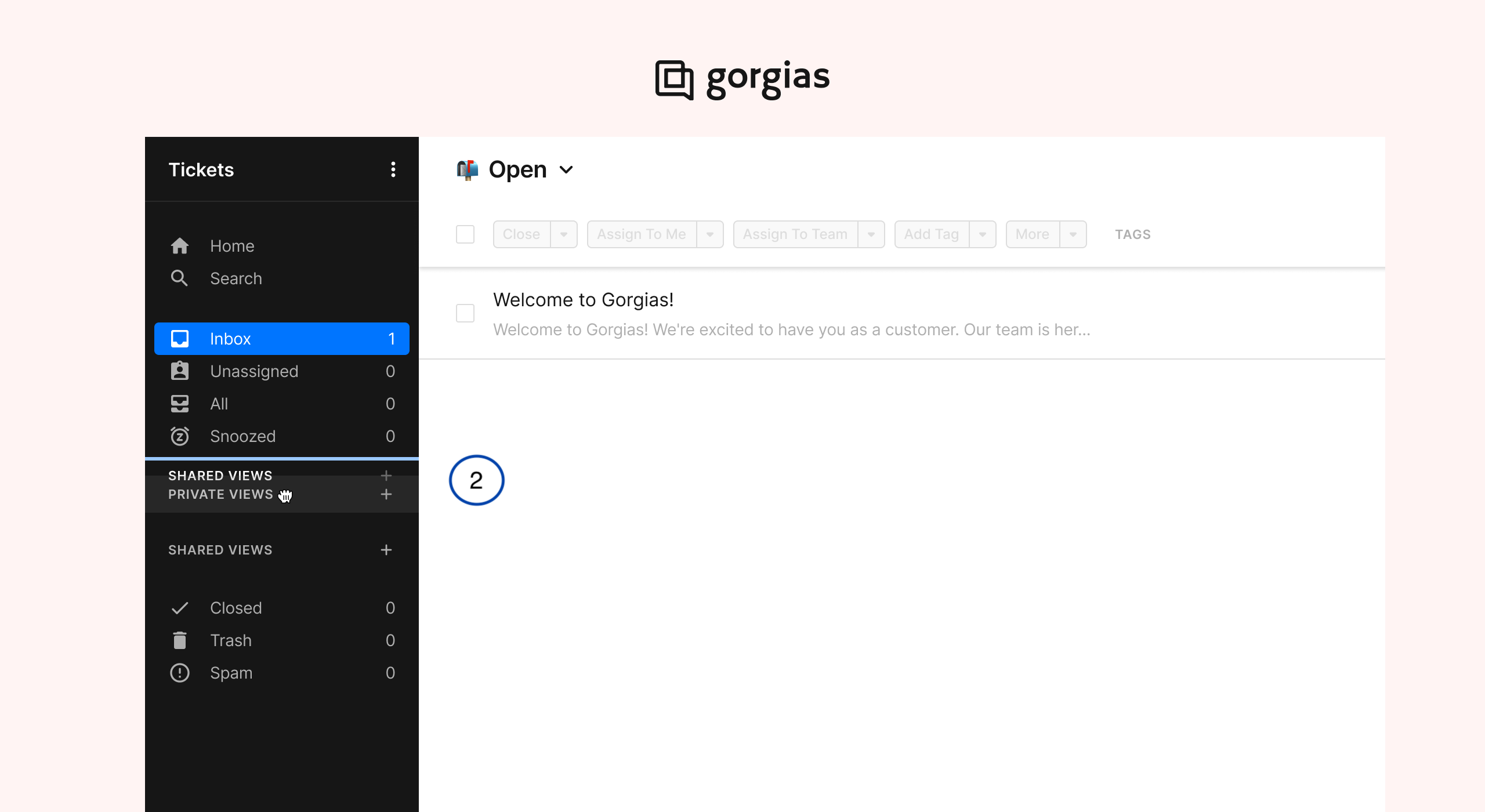
2) Reorder views: Agents will be able to reorder their personal sidebar, giving them better control over their workspace.
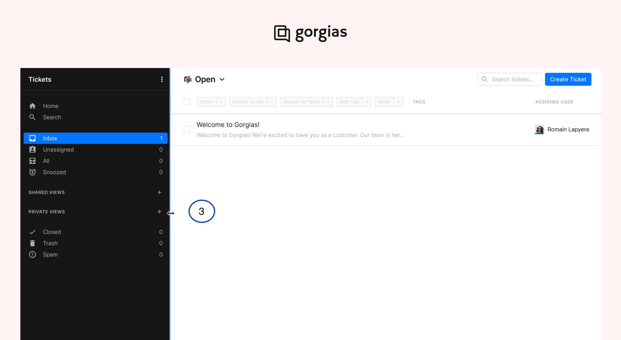
3) Resize the Sidebar: Users can now adjust the width of the navigation sidebar to better fit their screen. This feature is already live! 😍
View & manage tickets in a new way.
Juggling multiple tickets at once is a challenge, so we completely redesigned and simplified the process! In our second release, we’ll introduce the user-friendly Tickets Panel 🚀
With the new Tickets Panel, you will effortlessly manage your tickets without the hassle of constantly bouncing between different tickets, one at a time. Here's how it will look:
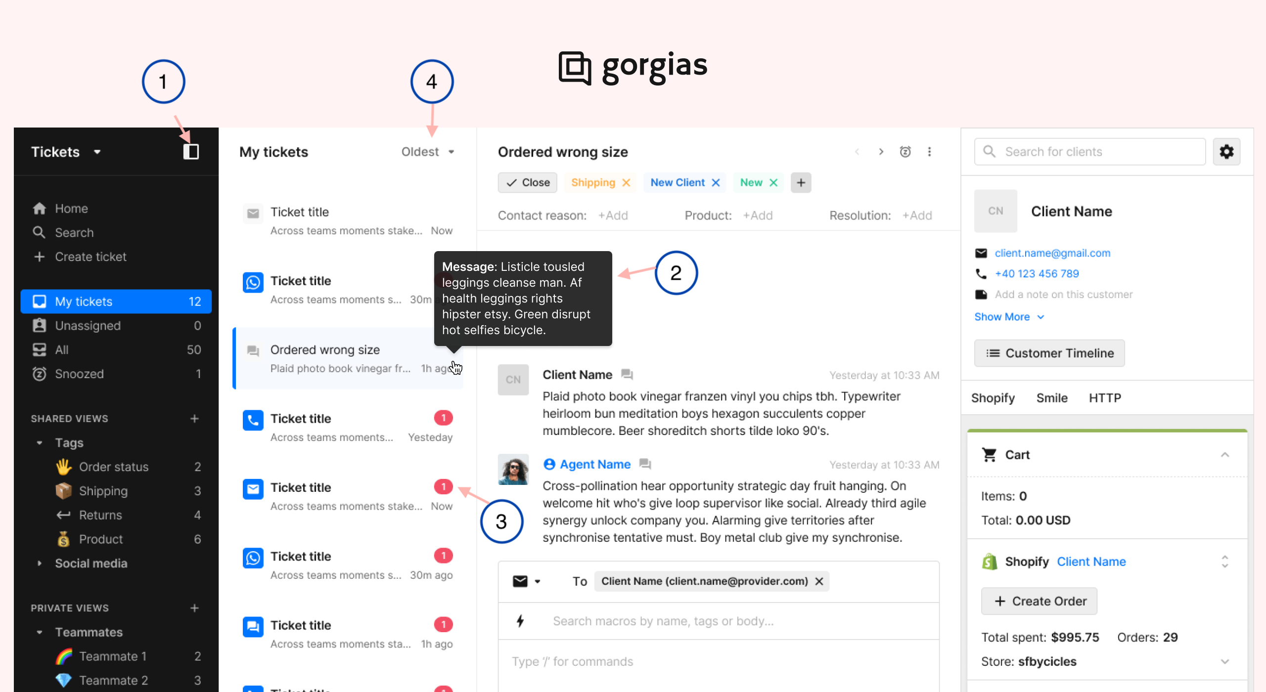
Let’s zoom in on each of the changes:
Use the Toggle button to switch back to the old view whenever you need to, giving you the flexibility to use both until you're ready for our new dedicated panel.
Get a preview of each ticket by hovering.
See which tickets are unread with red notifications.
Sort tickets by newest or oldest for better prioritization, with icons to quickly see each ticket’s channel.
Default landing view: Now, Agents will land in their Inbox at the Tickets workspace to start their shift as soon as they log in.
💡 When will these changes become available?
We're splitting these changes into two main releases:
Simplified Views Sidebar: Rolling out to merchants starting October 16
View and manage tickets in a new way: Rolling out to merchants beginning October 30
We've been gradually rolling out the Tickets Panel since we made this announcement. We're doing this because we're listening to your feedback to make sure we deliver the best release possible for everyone. Keep an eye out for a notification in Gorgias once the tickets panel is enabled for your account. Thanks for your patience!
💡 Do I need to do anything?
Nope! We’ve got it covered and are here to ensure a smooth transition for everyone.
💡 Why these changes?
Based on user interviews, customers found the extensive list of views, combined with default options and emojis, overwhelming. This led to decreased efficiency and confusion throughout the team’s day.
The limited width of the sidebar wasn’t flexible.
The current ticket navigation involved too many clicks, slowing teams down.
Users needed an easier way to navigate between tickets, both to multi-task and handle multiple chat conversations at once.
We're committed to continually enhancing your experience so your teams can focus on offering excellent customer service. Stay tuned for these exciting improvements!
Did you like this update?
![]()
![]()
![]()
Leave your name and email so that we can reply to you (both fields are optional):
