Campaigns just got a visual polish! 🧼
timestamp1701881993546

Exciting news! We just released a small update to the visual design of Chat Campaigns. There are no functionality changes — your Campaigns will continue to work as normal.
What changed, exactly?
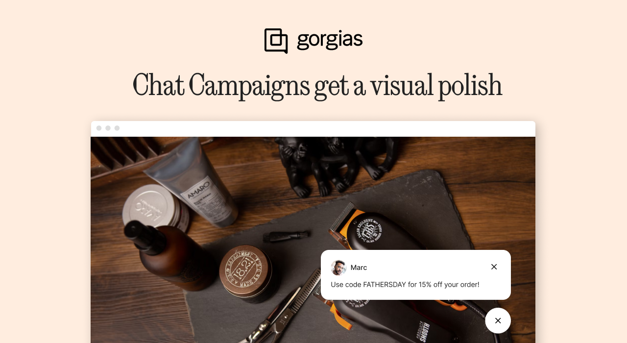
Chat Campaigns now have an updated design to match the new Chat design released earlier this year.
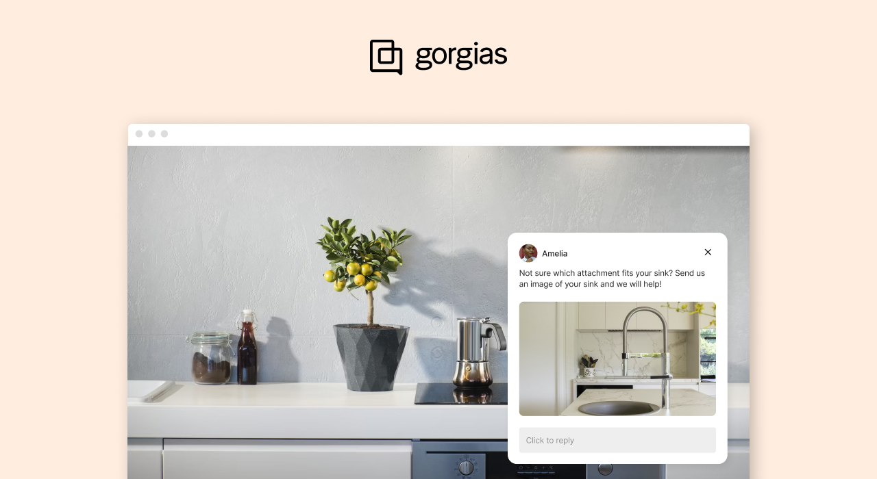
Here’s an example of a Chat Campaign with the updated look:

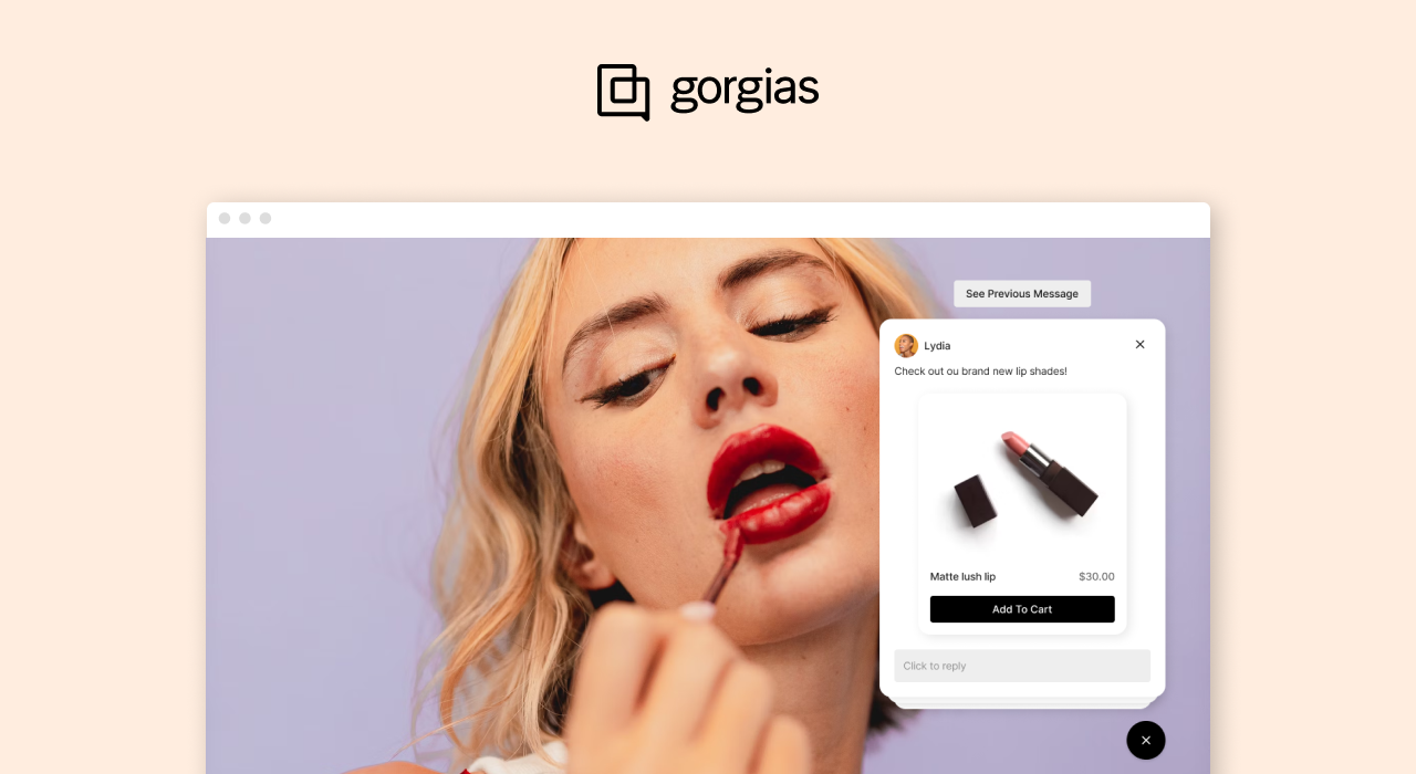
If you have multiple Campaigns running simultaneously on one page, they will now become a stack (instead of all appearing on the page, which crowds the screen). Here’s an example:

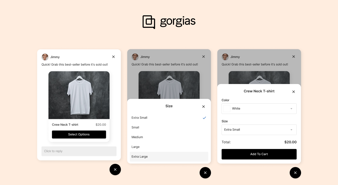
Finally, here’s an example of a Chat Campaign with a product card and an Add To Cart CTA (only available to Gorgias Convert customers):

Why did we make this change?
Earlier this year, we updated the visual design of Chat to be more mobile-friendly, modernize the interface, and improve your shopper’s experience.
Now, we’re updating the visual design of Chat Campaigns to match, giving your customers a more consistent experience and upgrading the look of your Campaigns.
Who does this impact?
The updated look is live for all Chat Campaigns, including advanced Campaigns sent with Convert as well as basic Campaigns.
Head to Settings > Chat > [Select a Chat] > Campaigns to view and manage your active Chat Campaigns.
What do I need to do?
Nothing! No action is needed from you.
These changes are subtle, but we know every single pixel on your website is important so we want to give you a heads-up about this change.
Did you like this update?
![]()
![]()
![]()
Leave your name and email so that we can reply to you (both fields are optional):
